Inter Milan removes letters FC from badge in push to be "an icon of culture"
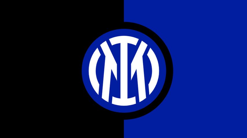
Italian football club Inter Milan has revealed a minimal logo created by graphic design studio Bureau Borsche as part of an effort to promote itself beyond sports.
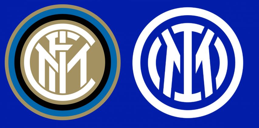
Football Club Internazionale Milano, which is widely known as Inter Milan, revealed a simplified crest designed by Bureau Borsche containing an update to the original logo designed by painter Giorgio Muggiani in 1908.
The revamped badge removes the letters FC, which stand for football club, from the logo.

According to the club, the simplified badge was created as part of a rebrand that aims to establish the club as a brand beyond its football-supporting base.
"Inter has moved to revamp its visual identity to open up to an audience that is increasingly digital and sensitive to aesthetics, to reach global targets and different age groups, and establish itself as an icon of culture as well as sport," said the club.
"The aim is to make the Inter brand relevant and recognisable beyond its fanbase and to allow a younger and international audience to identify with the values of inclusion, style and innovation that have characterised Inter since its foundation."

Designed by Muggiani, who was one of the club's founders, the original logo contained the letters FCIM in the centre of several concentric circles.
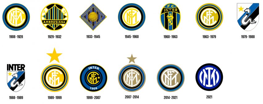
Muggiani's logo had been slightly altered in previous redesigns, but remained prominent in many crests including every logo used by the club since 1989.
The club believes that the current redesign is a "modern reinterpretation" of this original logo that maintains its essence.

"The new logo is a modern reinterpretation of the club's historic symbol, in a more streamlined and minimalist guise," said the club.
"While maintaining continuity with the original version, the new symbol is a more suitable fit for the age of entertainment."

The rebrand sees Inter Milan retain blue and black as its primary colours with the blue updated to be a "brighter and more modern" shade.
The new logo will be used on the club's official shirts from next season, with merchandise using the new branding already available.
A video announcing the rebrand plays on the fact the club's initials are IM
Inter Milan revealed the logo alongside a video that plays with the fact its IM initials spell "I'm" in English.
"The expression 'I am' is used to directly communicate the values and inclination of the club but also serves as a hook to describe the essence of every Inter fan without any distinction," said the club.
Inter Milan's rebranding follows one of Italy's other top-tier football clubs, Juventus, which unveiled its own minimalist rebrand in 2017. Like Inter Milan's overhaul, the logo was created to "transcend sport".
"The new visual identity has been designed to boldly take the club's spirit into new, unexpected realms," said the designer at the time.