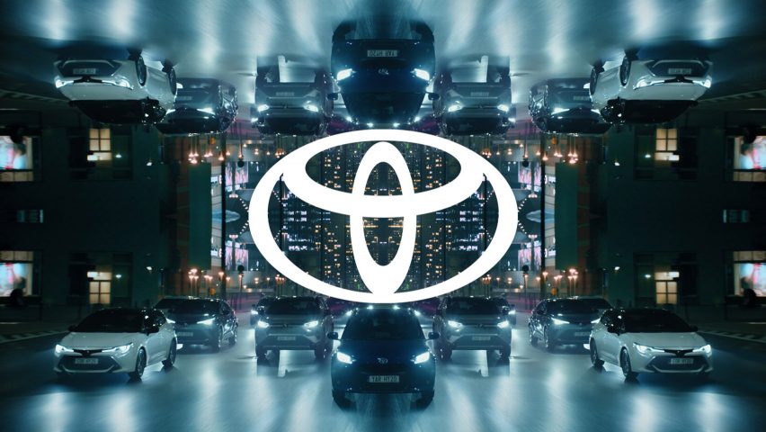
Toyota rebrands with flat logo and abandons wordmark
Toyota Motor Europe has joined numerous other car brands by opting for a flat redesign of its logo with a revised visual identity created by The&Partnership that includes removing its wordmark.
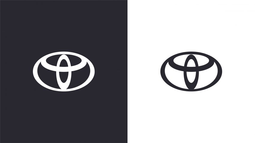
The new logo and branding was created by agency The&Partnership for Toyota's Europe division and sees the automaker's name removed and its old, 3D design flattened, leaving just a simplified, 2D emblem made up of three overlapping ovals.
This change, according to The&Partnership and Toyota, was an acknowledgement of the brand's visual recognition amongst European consumers, meaning it no longer needs to plainly state its name to be identified.

This the first time the Japanese auto company have rolled out a new logo since 2005, and the first time it has renewed its visual identity since 2009.
The new logo follows in the footsteps of many other car brands including Nissan and BMW that have swapped out the 3D designs of their logos for more minimal, 2D formats.
However, head of art at The&Partnership Dan Beckett doesn't consider this wave of flat design to be a "trend", but rather a practical resolution to the growing issue of readability at a time when digitisation has taken over.
"By their very nature, people experience car brand logos in the real world in the form of shiny silver things stuck on the nose of the car," Beckett told Dezeen.
"Twenty years ago it became fashionable to render logos with a shiny, three-dimensional aspect, but it wasn't just car brands, even masters of simplification – Apple – did it," he added.
"In print it looked OK – made the logo pop a little bit. But with the advent of digital brand touchpoints, and especially small mobile screens, all those fiddly bevels and gradients meant the logos became little grey smudges, indistinguishable from one another."
"So I don't see it as a new trend," he continued. "I see it as the logical solution to a universal problem created by a different trend. It's just more car brands got on that first bandwagon."
The rebrand was commissioned to ensure Toyota's "longevity in a digital world", as well as keeping its visual identity in line with its expansion into electrified vehicles, online retailing and new ownership models.
"The key to this project was not to simply see it as bringing the brand identity up to date, but preparing it for years to come," said Beckett.
"As well as re-modernising the brand we also sought to bring a more premium feeling while working hard to simplify the brand architecture and creating a design system which will be fluent across today and tomorrow's touchpoints," he continued.
"Toyota has recently made great forward strides in its product design and we really wanted to see that reflected in the visual identity."
The rebranding project was started in July 2019, and involved The&Partnership working with Toyota Motor Europe for over one year to create an online toolkit for those working with the brand to access.
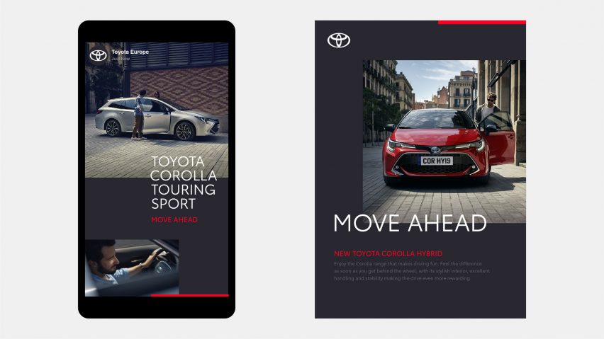
The design studio was given a four-point brief: to be forward-thinking, to prioritise mobile display, to grant the company a more "premium" feel, and to offer consistency across all parts of the business and its sub-brands.
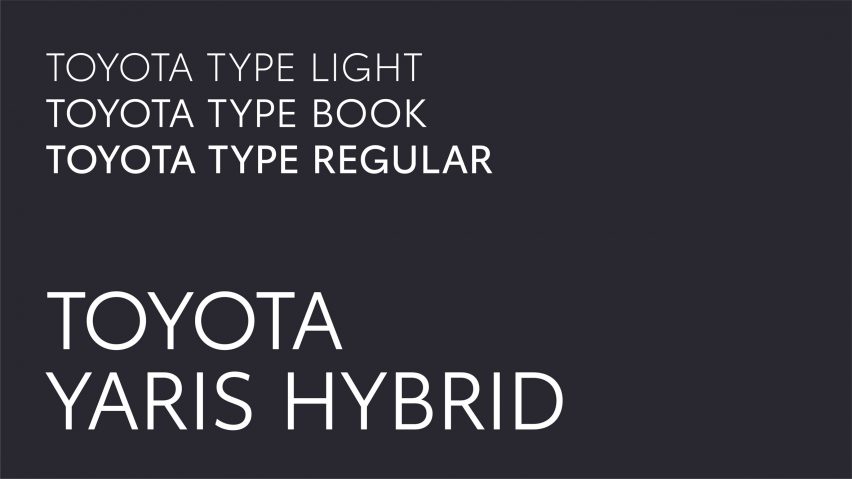
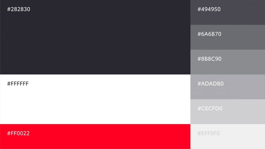
The agency also designed bespoke typography, called Toyota Type, for both digital and physical formats. The sans serif font features a monochrome colour palette with a red accent as a "distinctive nod" to the carmaker.
"The design communicates simplicity, transparency and modernity," said Toyota. "It is perfectly adapted to the digital space but equally effective in the physical world."
This new typeface accompanies several name changes across Toyota's different business areas, as "Toyota Insurance Management" becomes "Toyota Insurance Services", and "Toyota Plus" has been renamed "Toyota Approved Used".
The new logo, which was launched yesterday, will be rolled out across all internal and external Toyota brand communications in Europe, while the current logo will continue to be used for Toyota vehicles.
The current retailer signage will also remain in place and will be reviewed in the Toyota 2025 Network Strategy. The new logo won't be featured on any of Toyota's vehicles.
Toyota joins a long list of automakers that have also ditched the 3D design for a "flat" logo in a bid to modernise their brands.
Nissan was the latest company to launch its flat emblem – which reduced its original design of a circle overlaid with a rectangle for a pair of stylised lines – following on from BMW, Volkswagen and MINI.