IOC reveals "vibrant" brand identity for the Olympics
The International Olympic Committee has unveiled its brand identity for the Olympics, which includes custom typefaces, illustrations and graphics that aim to bring the legacy of the games into the modern world.
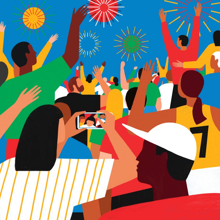
Canadian creative agency Hulse & Durrell partnered with the International Olympic Committee (IOC) to develop three custom typefaces, a series of graphics, 17 illustrations and a set of guidelines for how to incorporate the identity.
"The brand is a living beast, it's not something set in stone, but really our wish was to put the athletes, the sports and the Games part of the system and we all really felt we need to be more consistent," said IOC head of brand management May Guerraoui.
"The evolved brand pushes further the Olympic brand identity through a vibrant extended palette based on the Olympic colours, inspirational illustrations and tailored-made typography – it's about leveraging on a new design system to communicate the brand values with emotion," Guerraoui told Dezeen.
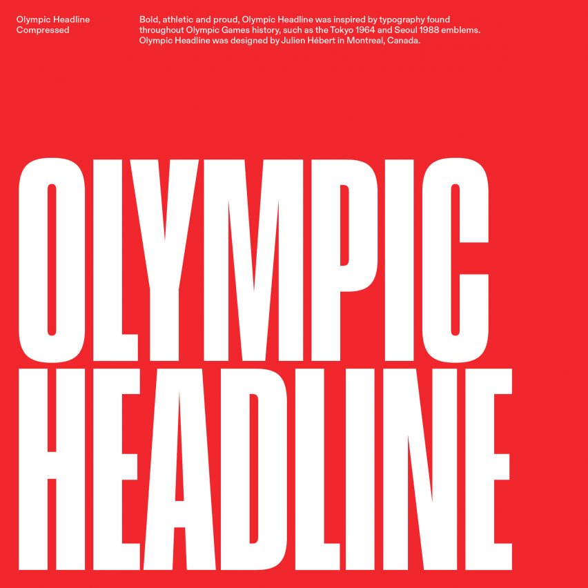
While the Olympic Games began in 1896, this is the first time a global brand identity has been created. The IOC began working on the project in 2018 and some aspects of it, such as the custom-designed typefaces Olympic Headline, Olympic Sans and Olympic Serif, have been rolled out over the past four years.
The typefaces were designed by graphic designers Fabian Harb and Seb McLauchlan from type design agency Dinamo and Julien Hébert of design studio Principal, while artists Francesco Ciccolella, Abbey Lossing and Karan Singh created the 17 illustrations for the brand identity.
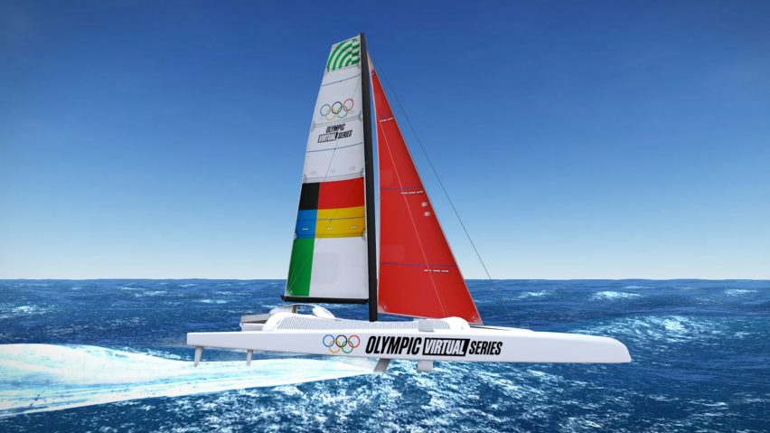
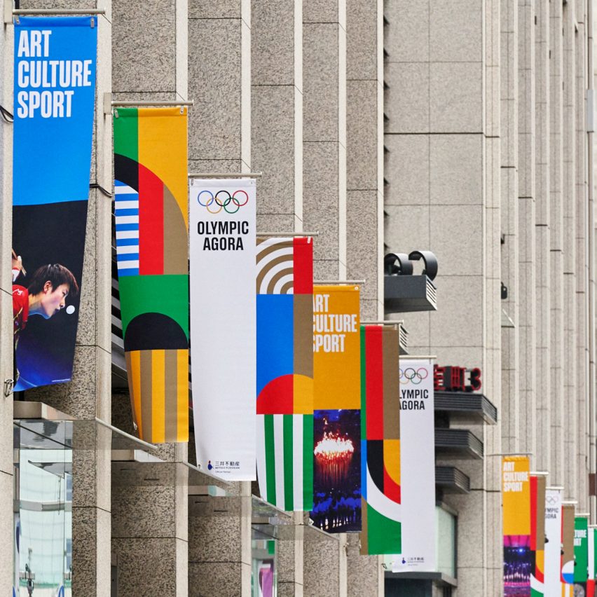
With the full brand rollout expected to be completed in time for the Paris 2024 Olympic Games, the updated brand identity will be used across all touchpoints of the brand including on banners, press releases and social media platforms.
The Olympic logo with its widely recognised five interlocked Olympic rings, which were designed by the founder of the modern games Pierre de Coubertin in 1913, remains unchanged.
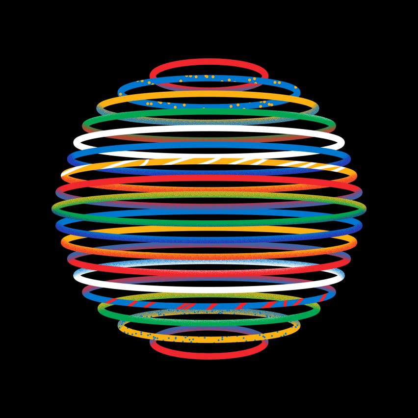
Although the primary colours found in the Olympic symbol – blue, yellow, black, green, red and white – have not been altered, the Olympic palette has expanded for digital interfaces, infographics and illustrations.
"In one way or the other, we adapted the rings to the new digital environments," explained Guerraoui."We didn't change the Pantone [colours] but we did change other specs for digital: CMYK and RGB."
International federations and national Olympic committees as well as the IOC's internal research and insights team helped the IOC decide on the new identity.
The teams conducted research and engaged in conversations with athletes, consumers and those within the organisation.
"We did a big consultation across the organisation to really understand what are the different needs in terms of corporate identity," Guerraoui said.
"Everyone admitted that we really need something consistent and powerful that leverages the Olympic rings and colour more."
According to Guerraoui, the new identity also aims to channel the Games' sustainability commitments, as it is designed to have a lower environmental impact in its print and digital mediums.
"Sustainability is one of the biggest criteria we have in everything we do," she said.
"The Olympic house where we are is one of the most sustainable buildings in the world," Guerraoui explained, referring to the organisation's 3XN-designed headquarters.
"We will always check with our sustainability team, are we using the right fabric? Are we using the right paper? Do we need to print in colour?" she said.
"For all the Olympic brand guidelines communications, for instance, all the format is sustainable when it comes to printing and the paper sizes."
While this is the first official brand identity, each winter and summer Olympic Games has a unique official set of emblems, which are often hotly debated.
An angular line drawing of the number 26 was chosen as the logo for the Milano Cortina Olympic and Paralympic Winter Games while logos informed by calligraphy were created for the Beijing 2022 Winter Olympics.
Project credits:
Client: International Olympic Committee
Agency: Hulse & Durrell
Creative direction and design: Ben Hulse and Greg Durrell
Art direction and design: Julien Hébert, Bryan-K. Lamonde, Principal
Illustrations: Francesco Ciccolella, Abbey Lossing, Karan Singh
Typefaces: Fabian Harb, Seb McLauchlan of Dinamo; Julien Hébert, Principal