Pentagram designs cannabis branding to advocate for "communities deeply harmed by the war on drugs"
Design studio Pentagram has created branding that references the injustice of America's war on drugs for Ben's Best Blnz cannabis company, which was launched by Ben & Jerry's co-founder Ben Cohen.
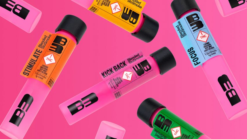
Pentagram was tasked with distilling these values into the packaging and brand identity for Colorado-based Ben's Best Blnz (B3), using a selection of colourful backgrounds with bold graphics with a 1970s psychedelic influence.
The branding is meant to reflect Cohen's mission for the brand, which includes donating 100 per cent of its profits to "the Black cannabis community and groups advocating for criminal justice reform".
"One of the first terms Ben used to describe the brand intent was 'activist'," said Pentagram lead Eddie Opara.
"Advocacy and the ultimate purpose of the brand to invest back into communities deeply harmed by the war on drugs were always central to what needed to be conveyed," he continued.
"We wanted that objective to exist in every facet of the brand and packaging."
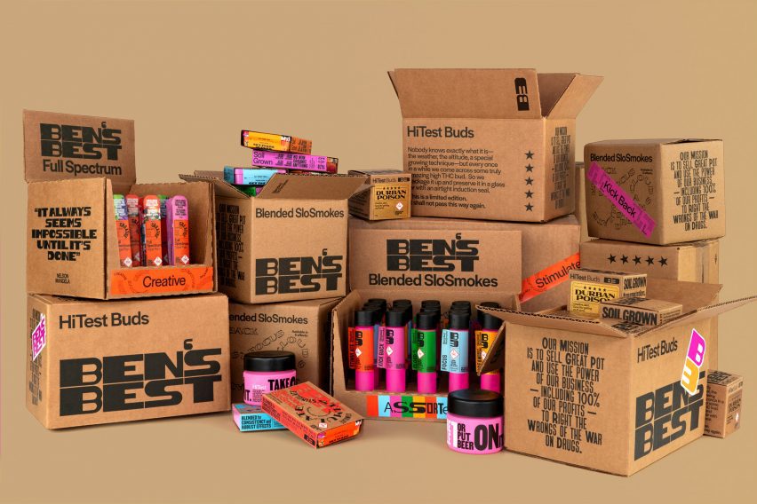
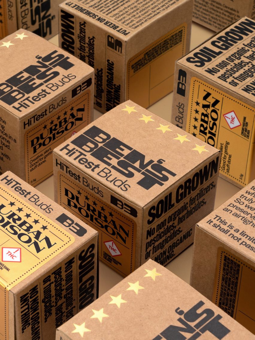
The packaging consists of cardboard boxes with black fonts and quotes from famous African and African-Americans such as former South African president Nelson Mandela and political activist Angela Davis.
It aims to highlight the disproportionate amount of Black people behind bars for cannabis-related offences.
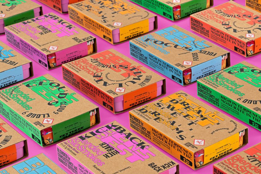
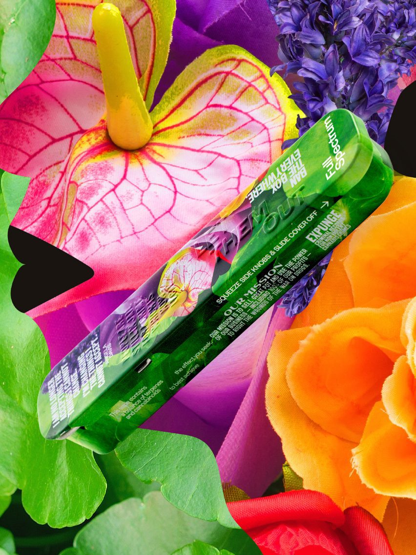
The cardboard boxes contain individual products, which include smokeables, vaporizers and edibles, that all have bright colours and densely worded quotations and descriptions.
These include the brand's mission statements, instructions and simple phrases that describe the purpose of the products such as "kick back" and "full spectrum".
"The packaging is deliberately heavy on type and text; it is designed to be explored and discovered over time as the reusable tin lays around the house," said Cohen.
"At times we thought of the packaging as an artfully designed Dr Bronner's soap bottle. But it turned out to be so much more than that."
The fonts were drawn from "typefaces created by Black designers and rooted in historical context".
These include primary fonts from Vocal Type Foundry, a font design studio founded by designer Tré Seals, while the supporting font is in Halyard, created by Joshua Darden.
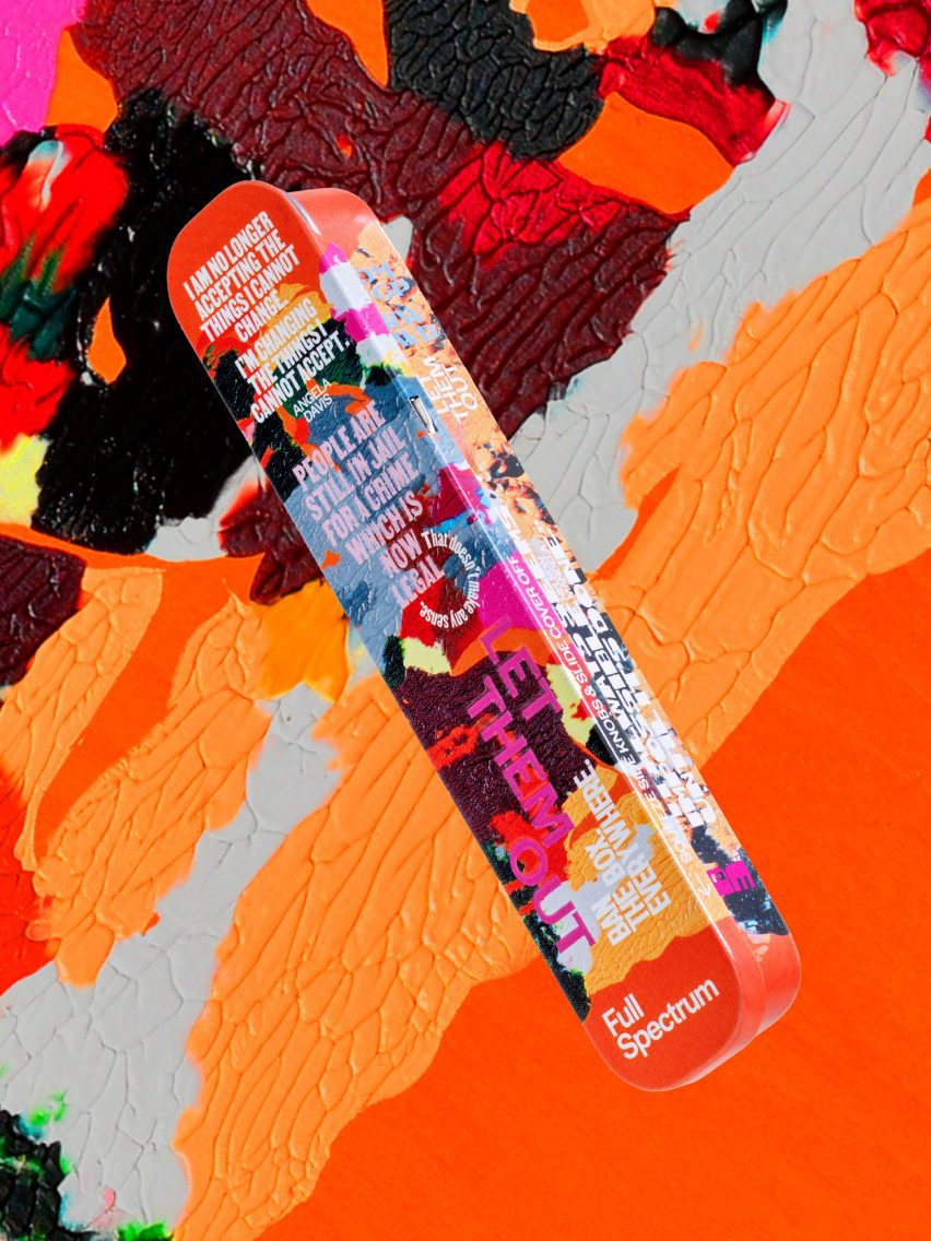
In order to address one of Cohen's main concerns – decarceration in step with marijuana's growing acceptance – the studio collaborated with Black artists and designers such as Brooklyn-based Dana Robinson for the tins and sleeves of the packing.
Robinson's work was drawn from her Ebony Reprinted series, which takes images from the long-running Black culture and arts magazine Ebony and recreates them in smeared paint.
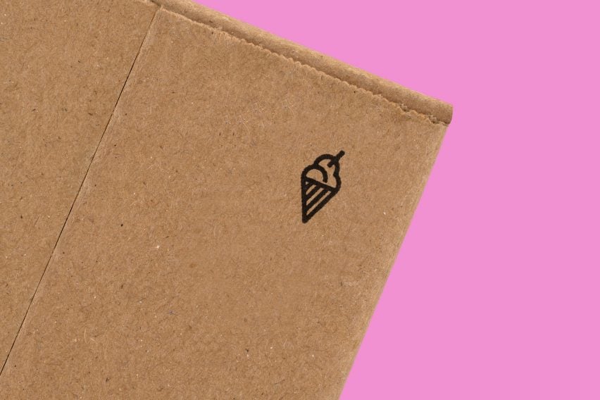
One image selected for B3 includes an ice cream parlour, a subtle nod to Ben & Jerry's, though B3 is a completely separate venture, and Opara said that small icecream cones were included on every package as "a wink to Ben's background".
Opara contributed the other artwork. This includes a photo collage that has a series of flowers shaped to look like a Black person in an orange jumpsuit.
According to Pentagram, the packaging is "sustainably produced and recyclable as possible". It shifted away from the child-proof plastic containers typical to cannabis products in favour of tin, glass and cardboard.
Pentagram was founded in 1972 in London and now has studios in the United States and Germany. Other branding initiatives undertaken by the studio include logo designs for music company MIDI as well as automotive company Rolls-Royce.