
Florence Institute of Design International presents 10 graphic design projects
Dezeen School Shows: an anti-fashion clothing brand that takes cues from postmodernism and branding for a healthy eating company influenced by Korean traditions are featured in Dezeen's latest school show by students at Florence Institute of Design International.
Also included is an airline rebranding project that takes cues from Japanese design and a branding design for a cultural centre in Uruguay that uses signature colours from the country's flag.
Florence Institute of Design International
Institution: Florence Institute of Design International (FIDI)
Course: graphic design
Tutors: Eleanor Ferguson, Dusko Stojanovic, Ingrid Lamminpaa and Maria Montesi
Final review jury: Kate Eadie, Federica Fabri, Ingrid Lamminpaa and Dusko Stojanovic
School statement:
"FIDI is an international design school located in the centre of Florence, Italy.
"The design research project studio courses are held during the final year of the three-year graphic design programme.
"The third-year graphic design research project is a self-driven body of work generated over a period of 30 weeks, culminating in a final presentation where students are given the opportunity to demonstrate the extent of their understanding and ability to apply design theory in practice.
"Students are required to form a working hypothesis, around which they must focus on delivering a unique graphic design solution to a real-world problem they have uncovered.
"Each project has its unique challenges and particular design angle requiring substantial primary and literary research on the topic.
"The three-year programme offers intensive curriculum teaching on various aspects of graphic design to acquire advanced skills and knowledge and develop professional practitioners within the international design community.
"The course results in a validated bachelor's degree, BA (Hons) Design, issued in collaboration with the University of Chester."
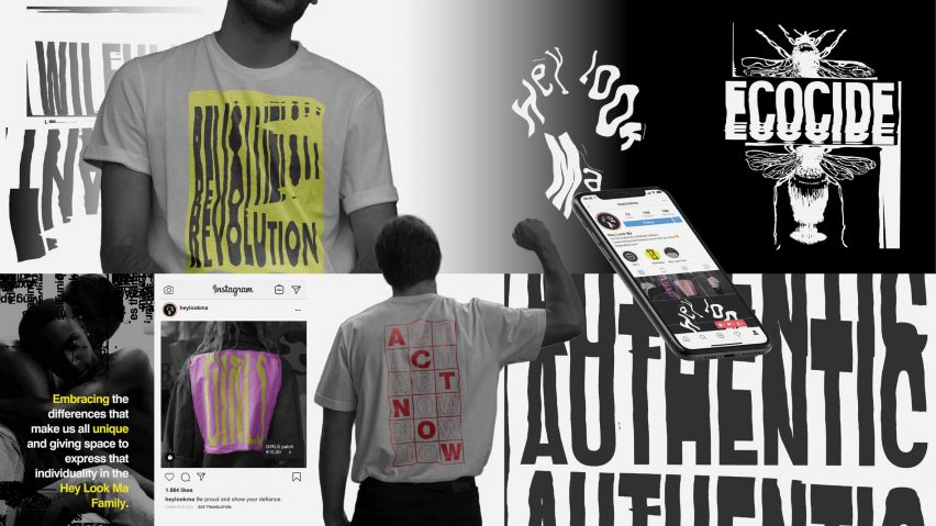
'Hey Look Ma' Sustainable Fashion, Fall 2019 by Jennifer Greinschgl
"Jennifer's design project aims to develop a community around the ethos and values of anti-fashion and to ignite a conversation about the environmental and social issues within the fashion industry.
"Her concept draws inspiration from past rebellious movements such as the punk era and postmodernism.
"With the fast fashion industry growing rapidly, Hey Look Ma encourages people to accept social responsibility and fundamentally change their behaviour.
"Using ambiguous messaging and visual provocations, the brand aims to guide society towards making ethical and more environmentally conscious decisions rather than to dictate them."
Student: Jennifer Greinschgl
Tutor: Eleanor Ferguson
Email: jen.greinschgl[at]hotmail.com
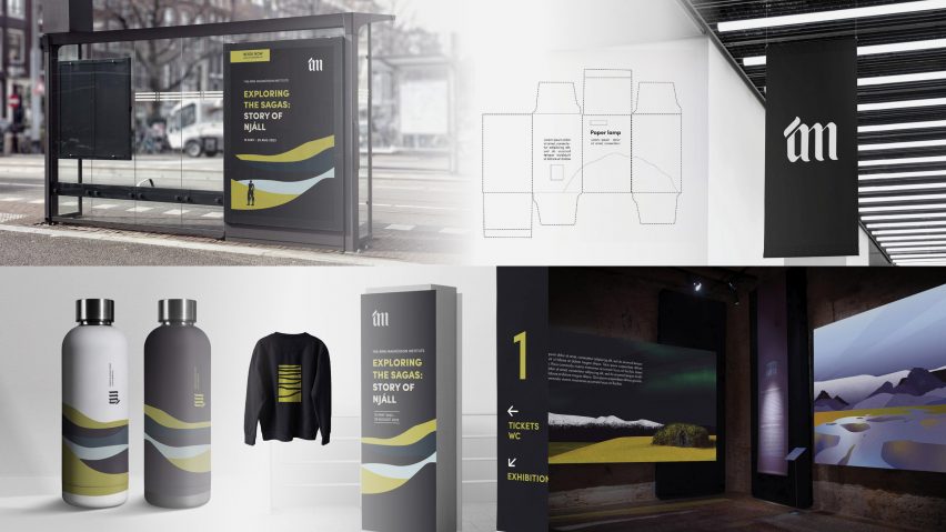
Re-branding for the Árni Magnússon Institute, Fall 2021 by Aldis Osk Unnarsdottir
"Aldis designed a full branding scheme for a new exhibition space dedicated to Icelandic manuscripts.
"Her aim was to assist the public in understanding Nordic history and culture, to convey the message from the manuscripts through graphic design and provoke curiosity through an engaging experience.
"The Árni Magnússon Institute is a research and cultural institute whose role is to conduct research on Icelandic studies, particularly Icelandic language and literature.
"Its purpose is to spread knowledge in these fields and to preserve and expand the collections they currently hold."
Student: Aldis Osk Unnarsdottir
Tutor: Eleanor Ferguson
Email: aldis.unnarsdottir[at]gmail.com
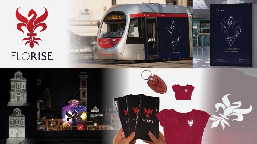
Florise Public Cultural Displays, Spring 2021 by Katja Osterlin
"Katja's concept for Florise combines art and technology to create a cultural exhibit that takes place throughout the city of Florence in a safe yet engaging way.
"Informed by a childhood memory of assisting with a projection mapping show, the brand's identity is inspired by rebirth, which has its origin in Renaissance Florence.
"The intention is to use a series of light and sound installations to deliberately control overcrowding while providing a cultural experience for people to enjoy."
Student: Katja Osterlin
Tutor: Eleanor Ferguson
Email: katja[at]osterlin.se
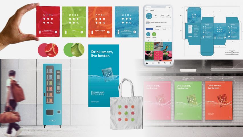
CTRL+Z Product Branding, Spring 2021 by Marika Varesi
"CTRL+Z is a health company targeting the current issue of dehydration in Canada's population, mostly due to the increase in alcohol consumption during the COVID-19 pandemic.
"With the culture of healthy living and wellbeing continuously growing, Marika has designed branding and merchandising for CTRL+Z in an innovative way, particularly for the pharmaceutical industry.
"The brand has four flavoured powder sachets containing electrolytes that aim to improve health and hydration.
"The concept is to use the branding itself to push the product, and the use of medical type font and a fresh aesthetic aims to build a trusting and transparent relationship with the customer."
Student: Marika Varesi
Tutor: Eleanor Ferguson
Email: marikavaresii[at]gmail.com
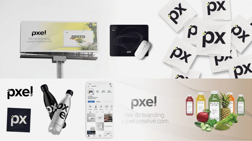
Pxel Design App, Spring 2021 by Lukas Kaiser
"Lukas saw a gap in the market to provide new businesses with the help required to elevate their company visually.
"Pxel is an intuitive website interface that allows customers to browse for a design that they feel fits with their own company's products and values.
"Minimalist graphics and clean neutral colours give the branding a sharp, professional look. The use of only black and white throughout the website allow users to browse the categories on a blank canvas."
Student: Lukas Kaiser
Tutors: Eleanor Ferguson, Dusko Stojanovic, Ingrid Lamminpaa and Maria Montesi
Email: lukaiser77[at]gmail.com
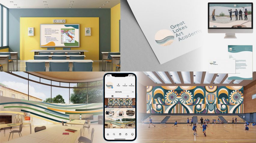
Riley Stratton School Design, Spring 2022 by Riley Stratton
"For her design research project, Riley created a new graphic aesthetic for Great Lakes Art Academy.
"Her aim was to transform the dull, unmotivating environment of the school into somewhere colourful and conducive to childhood development.
"The redesign of the school applies to the interior spaces, the learning materials, wayfinding and marketing.
"The colour palette was carefully selected based on the research on colour psychology and the benefits colour has for both teachers and students. Organic lines and shapes flow throughout the school, using new maps, signs and murals to tie the concept together."
Student: Riley Stratton
Tutor: Eleanor Ferguson
Email: [email protected]
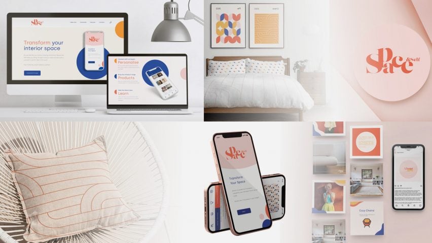
Space & Self Home Design App, Spring 2022 by Ishanou Mohindra
"Ishanou's project Space & Self addresses the problem of poor mental and physical health, adversely affected by the badly designed environments we live in.
"The initiative aims to repurpose objects as an affordable way to improve interior design and organisation.
"Using research on the negative effects associated with poorly designed spaces and unorganised homes, Ishanou has developed the app to be accessible through affordability.
"Space & Self also connects its customers to design specialists who help them create personalised and better-designed spaces. The use of bold, strong colours with simple shapes contributes to an easy-to-use app with a fun, playful theme."
Student: Ishanou Mohindra
Tutor: Eleanor Ferguson
Email: ishanou.m[at]gmail.com
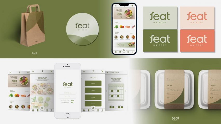
Feat Branding Design, Fall 2020 by Dohui Hwang
"Feat is an innovative guide to healthy eating derived from the practices of Korean medicine. The purpose is to provide personalised guides for people to encourage healthy habits.
"The company assesses on an individual basis and creates a unique salad for optimised health and immunity.
"The practices of Korean medicines are combined with western food culture to help expand the reach of Korean traditions while remaining relatable to western societies."
Student: Dohui Hwang
Tutor: Eleanor Ferguson
Email: hdheuhdh[at]naver.com
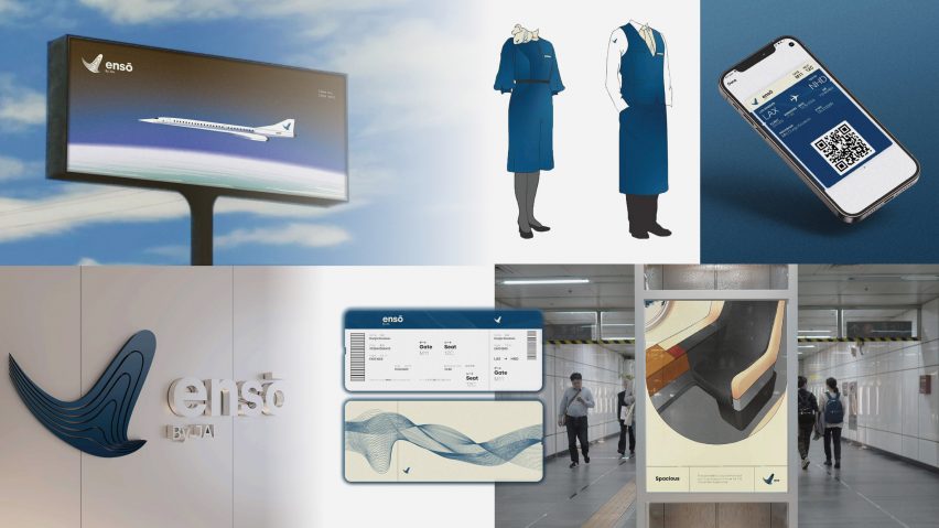
Enso Luxury Airline Branding, Fall 2021 by Maximillian Tassev
"Max has developed a brand identity for a luxury airline company that will fly the newly designed Overture supersonic jet.
"Enso is targeted at business people and those with little time who will enjoy the comfortable, contemporary and more sustainable airline.
"He draws visual inspiration from three main Japanese cultures and artistic periods, Zen, Edo and Retrofuturism, with the goal of encapsulating a serene, tranquil environment while simultaneously creating a futuristic and fresh aesthetic.
"The marketing of the airline uses a logo symbolic of the dynamism of the aircraft soaring through the sky in its advertising, tickets and marketing materials, while the clever use of a simple colour and graphic style create a consistency across the branding."
Student: Maximillian Tassev
Tutor: Eleanor Ferguson
Email: maxtassev[at]gmail.com
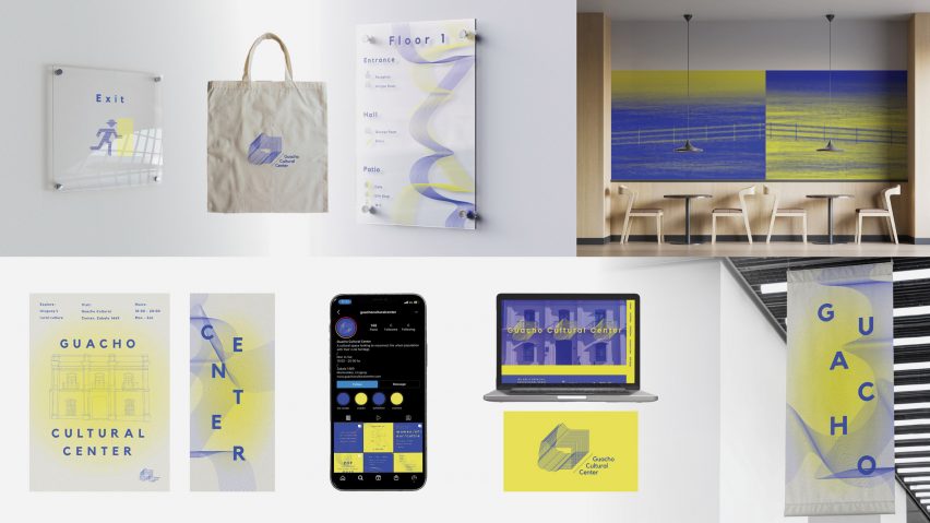
Guacho Cultural Centre, Spring 2022 by Maria Cruz Espalter
"Maria's design research project focuses on the overall branding of a cultural centre whose purpose is to encourage youth in Montevideo, Uruguay to reconnect with their cultural heritage.
"She has designed the centre to encourage curiosity that is particularly lost in young people living in the city today.
"Using vivid contemporary graphics, the institution will integrate interactive elements and super-graphics that differ from typical forms of displaying history, which often lack innovation and imagination.
"The design for the centre's logo and graphics are abstracted from cultural elements, such as the colour of the country's flag and patterns found in traditional Uruguay clothing."
Student: Maria Cruz Espalter
Tutor: Eleanor Ferguson
Email: macu.espalter[at]hotmail.com
Partnership content
This school show is a partnership between Dezeen and Florence Institute of Design International. Find out more about Dezeen partnership content here.