Eight interiors that use a monochrome palette to make a statement
From a mint-green eyewear store to an icy grey skincare clinic, the interiors in this lookbook feature monochromatic palettes.
Monochrome palettes use just one main colour throughout a space, with variations in tones, shades and tints incorporated into furniture, finishes and other details.
The spaces below, which range from retail to residential interiors, use colours ranging from dark brown to light pink to make a statement.
This is the latest in our lookbooks series, which provides visual inspiration from Dezeen's archive. For more inspiration see previous lookbooks featuring basement apartments, lattice screens and textural kitchens.
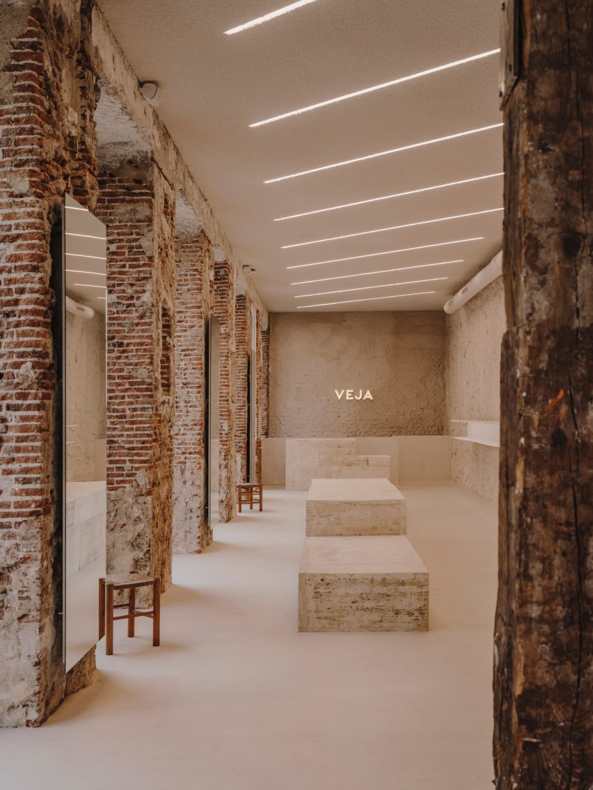
Veja Madrid store, Spain, by Plantea Estudio
Plantea Estudio designed this Veja store in Madrid to look like the studio did very little in the space, leaving the raw shell exposed and working with earthen materials.
Beige concrete benches were paired with plaster-coated walls to create a space dominated by the colour, and slightly contrasted with exposed original brick.
Find out more about Veja Madrid store›
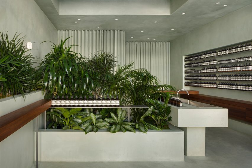
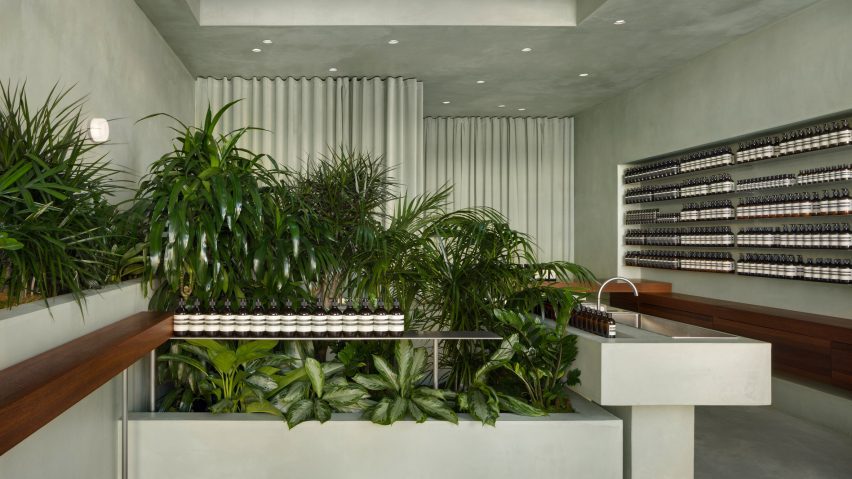
Toronto-based studio Odami coated this minimalist Aesop store in Los Angeles with a light-green micro cement to create a direct contrast to the brand's distinctive brown bottles.
The minty green colour of the interior, which covers the floors, walls, ceilings, display stands, central sink and a velvet curtain, was inspired by the lush valleys of the surrounding landscape.
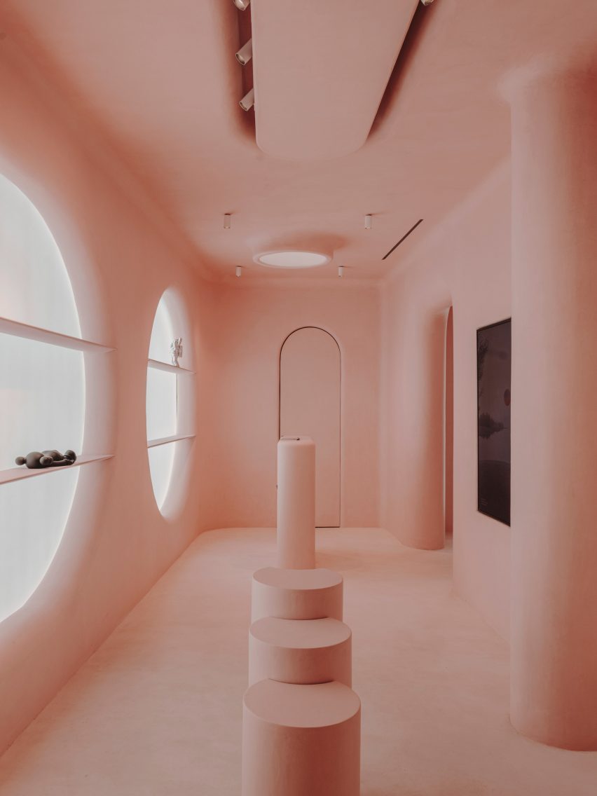
Moco Museum retail space, Spain, by Isern Serra
A computer-generated image by artist Six N Five was translated by design studio Isern Serra into this retail space in Barcelona, which is attached to the Moco Museum.
Six N Five is known for their pastel-hued concepts, which Isern Serra made a reality by using pink micro cement to coat the interiors.
Find out more about the Moco Museum retail space ›
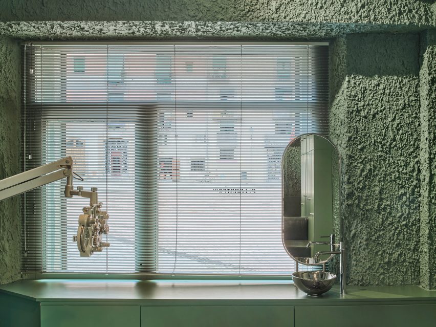
PJ Glasses, Spain, by El Departament0
This glasses store in Barcelona, designed by El Departamento, was designed to challenge the eye with different green hues.
"The human eye is able to distinguish more different shades of green than any other colour," El Departamento told Dezeen. "That's because, deep inside us, we're still hunters from the prehistoric era."
Find out more about the PJ Glasses store ›
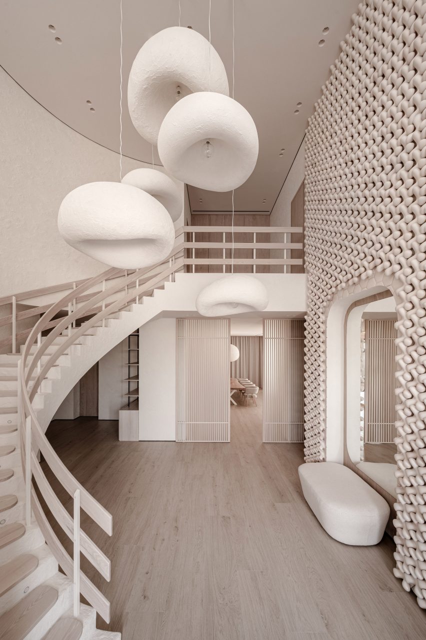
Mureli House, Ukraine, by Makhno Studio
Completed just before the Russian invasion, the Mureli House in Ukraine employs a variety of textures and forms in the same colour to create a dynamic yet calming space.
The only exception to the all-beige palette is the main bathroom, which features a shower finished with pink ombre glass.
Find out more about the Mureli House ›
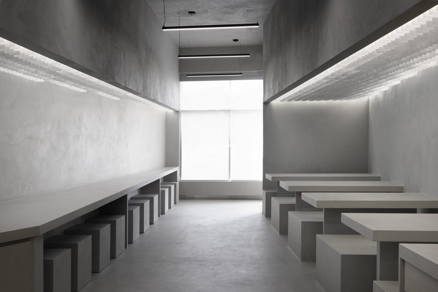
Bao Restaurant, Canada, by StudioAC
Located in a strip mall in Ontario, this Chinese restaurant was created by Canadian firm StudioAC to provide an efficient dining and takeaway experience with a distinctive style.
Using micro cement, stainless steel and vinyl, the studio clad the interior in soft greys as a response to the site while leaving the exterior simple to blend in with surrounding stores.
Find out more about the Bao Restaurant ›
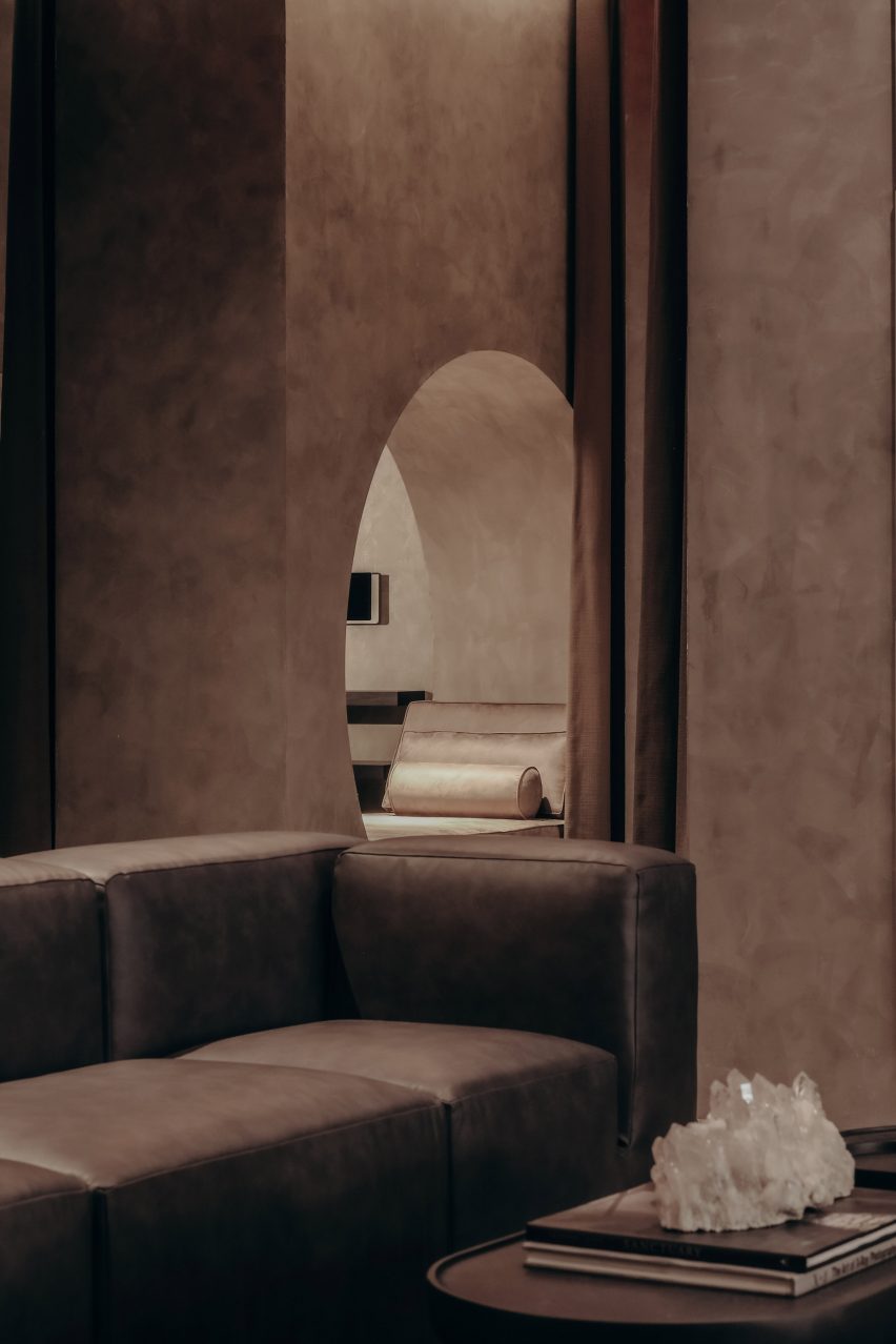
Remedy Place, USA, by Remedy Place
Remedy Place used soft furniture and warm tones to contrast traditional medical facilities at this wellness centre located in New York City.
The walls of the space are clad in a Venetian plaster and furnished with dark brown leather couches and cabinetry for a space that is "designed to heal," according to the studio's cofounder Jonathan Leary.
Find out more about Remedy Place ›
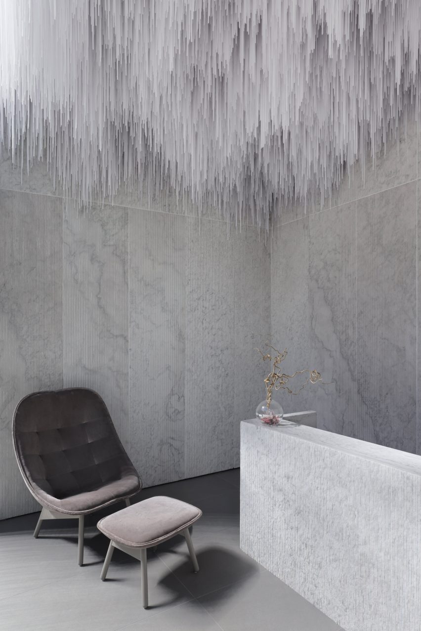
AER Skinlab, Canada, by Leckie Studio
Designed by Leckie Studio, this skincare lab in Vancouver was envisioned as a cave or quarry.
The reception desk and walls were clad in marble, with light-grey coloured treatment rooms down an adjoining hall. An installation made of Tyvek designed to look like stalactites was installed in the space, further adding layers of light greys to the cavernous space.
Find out more about AER Skinlab ›
This is the latest in our lookbooks series, which provides visual inspiration from Dezeen's archive. For more inspiration see previous lookbooks featuring basement apartments, lattice screens and textural kitchens.