Pentagram creates "21st-century identity" for Yahoo
Pentagram has redesigned Yahoo's logo and branding to give the search engine a "bold and confident" identity for the 21st century.
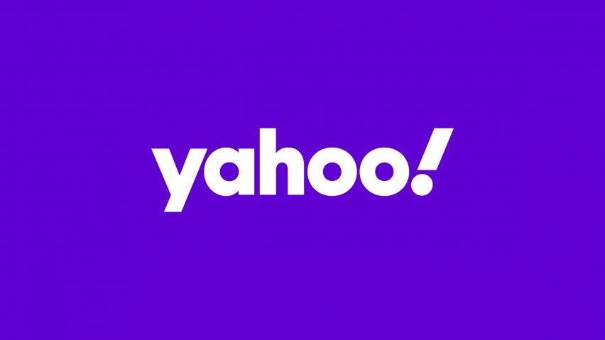
The logo has been designed to be more simple and flexible than the previous design, but also look back to the fun of the brand's "Looney Toons-style" logo from 1996.
"Yahoo is one of the digital world's iconic brands and its original logo perfectly captured the spirit of the early days of the internet," said Pentagram partner Michael Bierut.
"We were determined to reflect the brand's idiosyncratic roots, which is why we retained and strengthened the Yahoo exclamation mark," he told Dezeen.
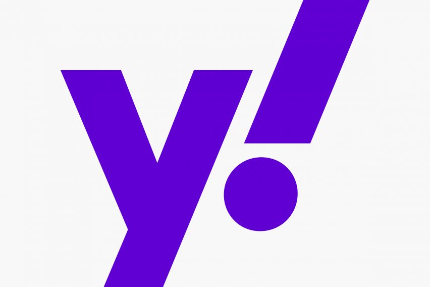
The capital letters of the logo's previous iterations have been abandoned in favour of lower case letters.
The brand's exclamation mark is italicised to give emphasis and is alined at 22.5 degrees to match the angle of the Y.
"The exclamation mark's exaggerated italic treatment helps bracket the wordmark with two strong diagonals, and calls back to the Looney Toons-style charm of the original 90s mark," explained Bierut.
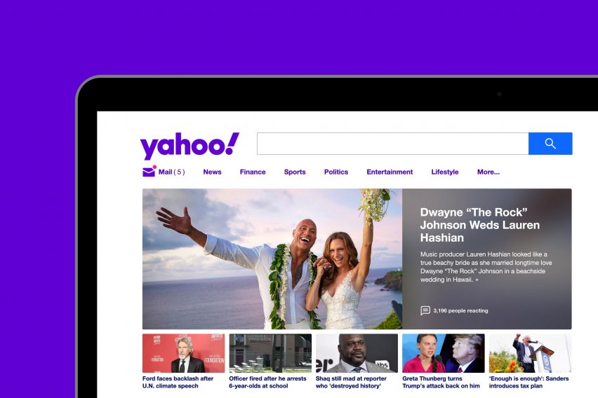
The new identity has been created to mark Yahoo's new brand strategy of focusing on helping users find a more customised experience online. The design is meant to represent this new chapter for the company.
"Today, Yahoo is not only a place for fun, but a place where people go for world news, investment advice, and reliable weather reports," said Bierut.
"We were so lucky to work with the team at Yahoo to find a balance between what's always made the brand distinctive – the exclamation mark, the colour purple, the yodel – while creating a 21st-century identity system that responds to the needs of its hundreds of millions of users."
The logo is written in the Centra No. 2 Extrabold font, with the letters modified to be more geometric and compact. Purple, which has been the Yahoo colour since 2009, is used throughout the rebrand.
A bright shade called "grape jelly" is used as the the primary colour, with secondary shades of "hulk pants" and "malbec".
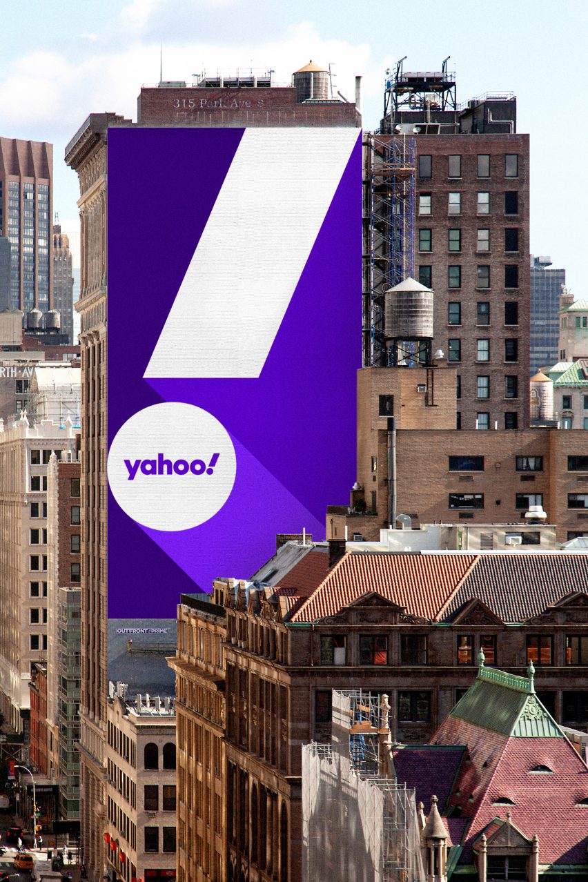
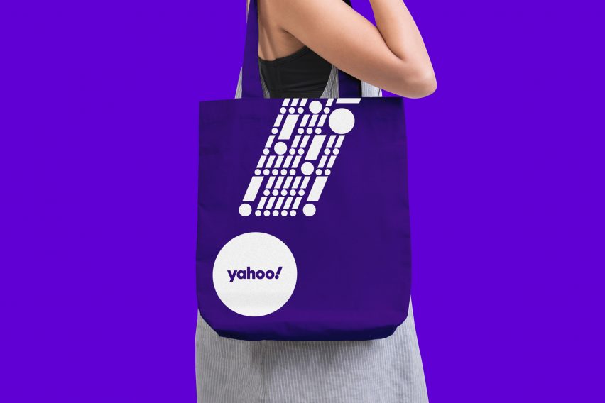
Pentagram designed the logo so that it can work across both physical and digital platforms and at all scales – from the side of a building to a mobile app.
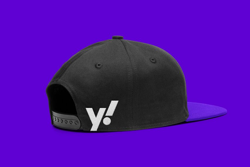
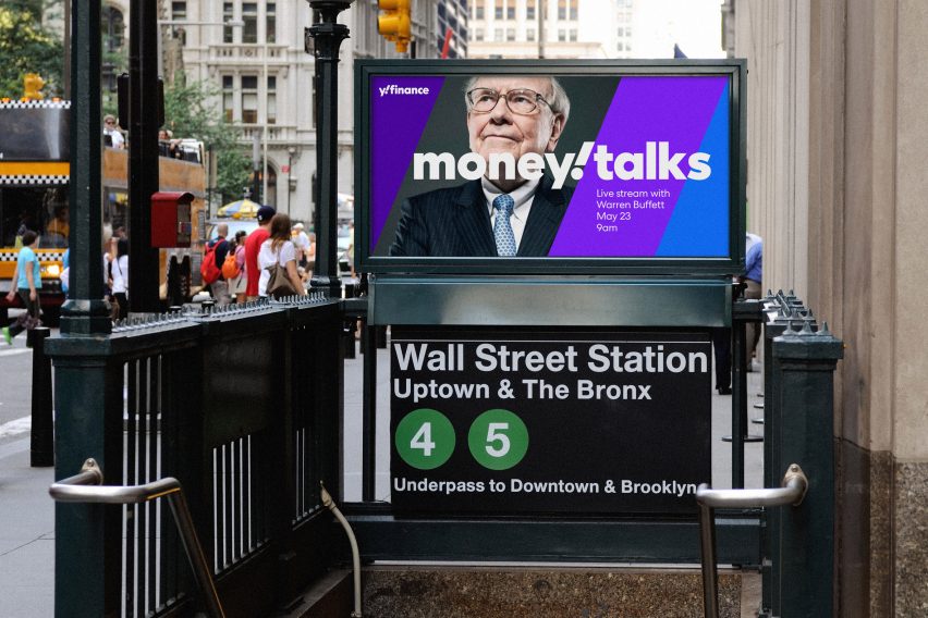
The logo has been designed so that it can be streamlined to create a y! monogram, which will be used across Yahoo's sub-brands.
"We worked closely with the creative and product teams at Yahoo to make sure that it will work well across media and across platforms," explained Bierut.
"The shortened y plus punctuation treatment formalises a way of communicating the brand more telegraphically. All elements are designed to support sub-brands like Yahoo Finance and Yahoo Sports in a way that's clearer than ever before"
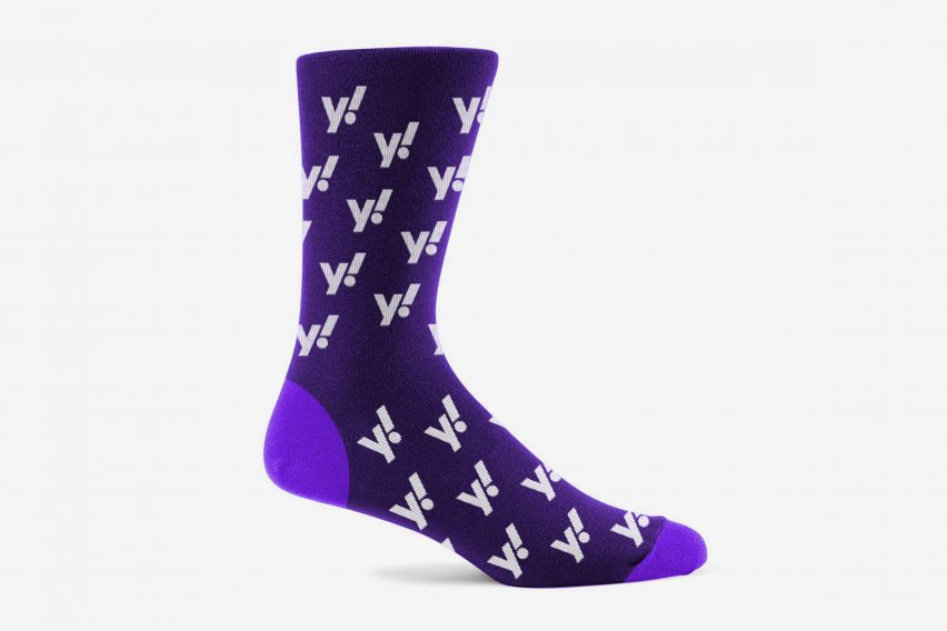
The y! monogram could also be on clothing such as caps and socks, although Bierut does not think that Yahoo will be abandoning web services to become a clothing manufacturer in the near future.
"At the end of the day, it's hard for a company called Yahoo to not be fun on some level," he said. "And I believe they are currently assessing potential demand before they fully commit to the sock business!"
Pentagram is one of the world's largest design consultancies, it has previously carried out major overhauls of Slack, America's Library of Congress in Washington DC and the Battersea Dogs & Cats Home.
Yahoo is one of numerous companies that have simplified their branding in recent years. Earlier this year London studio Red&White created a minimal logo for BT, while Mastercard dropped its name from its logo to be clearer.