Six typefaces that make use of the human body and bodily fluids
Here are six examples of typography informed by or made using the human body, including a sex-position typeface, wispy letters formed from strands of hair and letters traced from urine.
Body Type by Julius Raymund Advincula
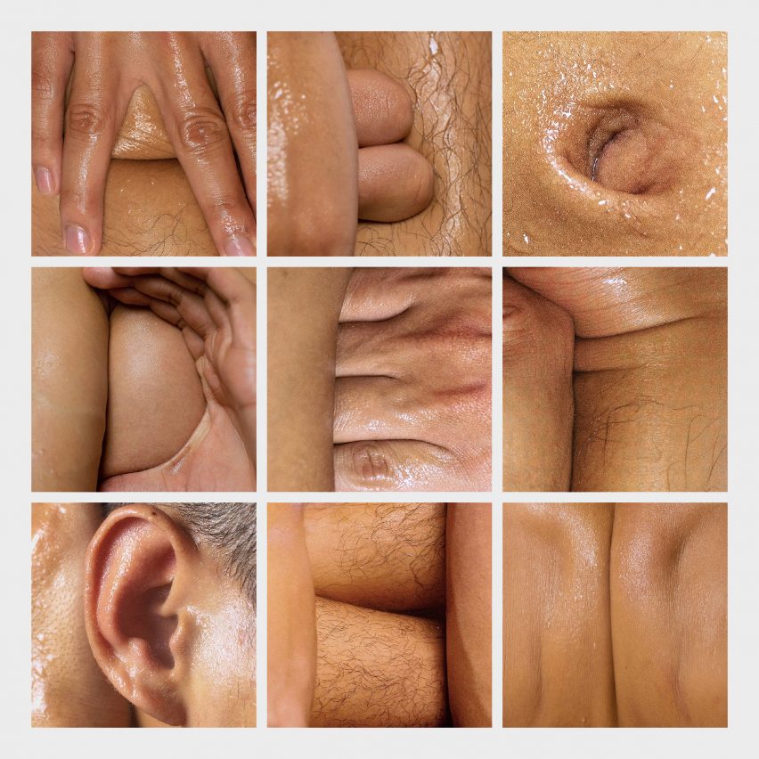
Filipino graphic designer Julius Raymund Advincula used the folds of his skin to create Body Type, an alphabet that finds hidden letterforms in unlikely combinations of body parts.
Advincula, who works under the name Subhelic, included his thumbs, ears and bellybutton in the typeface, photographed in glistening and suggestive snapshots after spraying his body with a mixture of olive oil and water.
The alphabet ranges from the obvious to the subtle, and was reviewed by designer Stefan Sagmeister in his renowned Instagram design clinic.
Find out more about Body Type ›

Kama Sutra A-Z coffee table book by Malika Favre
Kama Sutra A-Z is a book by French illustrator Malika Favre featuring a set of clean geometric shapes rendered in only four colours that depict naked bodies arranged in sex positions.
Each visual correlates to a letter of the alphabet to form a typeface. Favre paired each letter with an erotic verse or text by well-known writers such as Shakespeare and Emily Dickinson.
The illustrator described the project as "carefully trying to walk that line between sensuality and vulgarity," with an emphasis on inclusivity between genders and sexual orientations.
Find out more about Kama Sutra A-Z ›
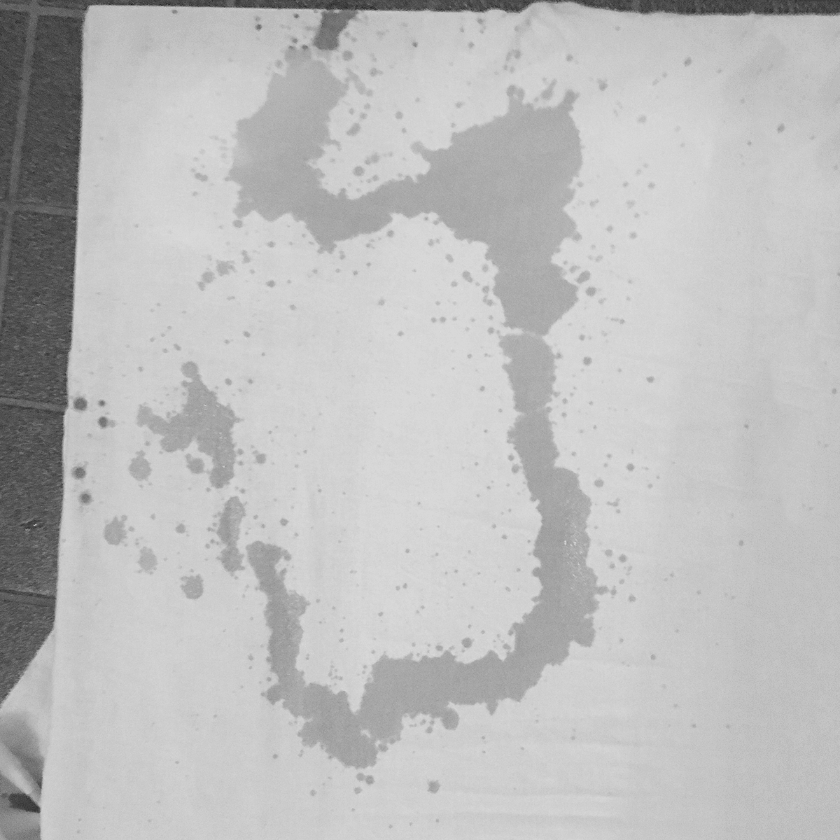
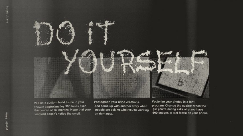
Swedish punk band Pissjar christened the record sleeve of their 2018 album, Apathy & Cheap Thrills, with typography made from their own urine.
Aptly named Pissjar Sans, the typeface was created by the band who took it in turns to urinate on a series of stretched-out bedsheets over six months, after which Pissjar's bassist Anthony Bolin photographed and vectorised the letters using a font software.
Designed to convey what Bolin defined as "the dirty hardcore punk that we play," the band released Pissjar Sans as a free downloadable typeface for anyone to use.
Find out more about Pissjar Sans ›
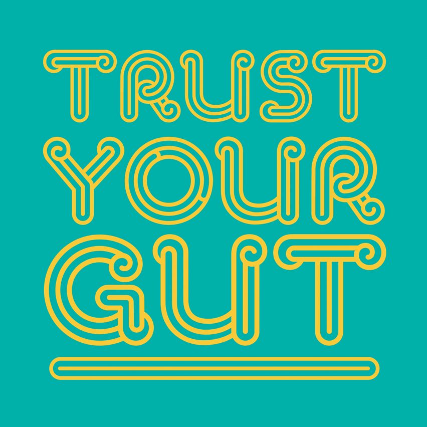
Bristol-based design firm Taxi Studio created a typeface informed by the twisty shape of human colons for Never Too Young, a campaign that is part of the charity Bowel Cancer UK.
Never Too Young was founded by the late Sophia Sangchi in an effort to raise awareness of the risks of bowel cancer in young people. Sangchi passed away from the disease in 2019, and the typeface was named in her honour.
Designed in bold colours, the punchy letters spell out assertive but supportive messages sporting wordplay such as "trust your gut" and "we know it's poo".
Find out more about Sophia Display ›
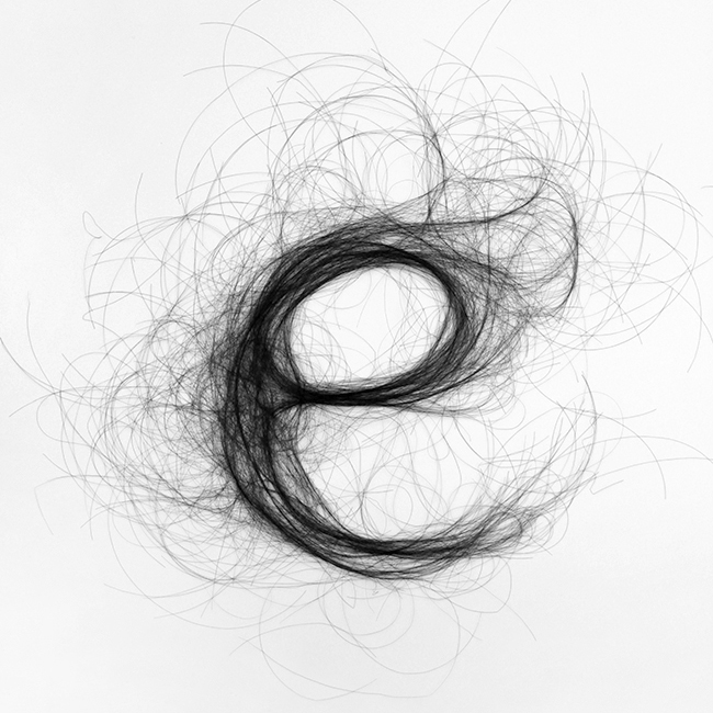
Hair Typography by Monique Goossens
Amsterdam designer Monique Goossens used strands of human hair to create whimsical letters that form a distinctive alphabet.
Hair Typography was made by arranging bunches of dark human hair into letters that are dense in the centre and become thin and spidery around the edges, resembling fine pen drawings.
"The ends of the hairs form an organised chaos, an energetic play of lines which forms a haze around the letter's basic shape," explained Goossens.
Find out more about Hair Typography ›
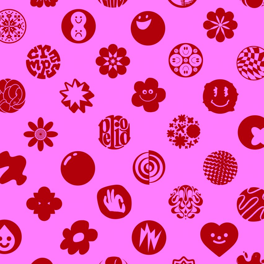
Periods for Periods by 140 international designers
140 graphic designers from around the world including Ellen Lupton and Pentagram's Giorgia Lupi collaborated to make Periods for Periods, a blood-red typeface made of fullstops to protest against period poverty.
Ranging from abstract squiggles to playful smiley faces, the designers interpreted the punctuation in their own ways in order to communicate the campaign's tagline "end a sentence, start a revolution."
The creative project was headed by Canadian agency Rethink Communications, and aims to address the stark presence of period poverty in schools in America, which means that many students cannot afford sanitary products.
The typeface is available to download, and users are encouraged to use it in their own designs to raise awareness of the campaign's message.
Find out more about Periods for Periods ›