"We wanted to create a symbol" with new minimal BT logo says designer Paul Franklin
London studio Red&White is behind the new minimal logo of telecommunications company BT. Studio founder Paul Franklin told Dezeen that confidence was the key to rebranding the British icon.
Red&White's brief was to create a more modern and "useful" visual identity, replacing the multicoloured globe logo that the organisation had been using since 2003.
According to Franklin, who is founder and creative director of Red & White, the challenge was to change the perception of BT from an "old-fashioned" telecoms company to a forward-facing technology company.
The new stripped down emblem, which will be fully launched at the end of August, sees the BT letters printed in a plain, sans-serif font in the centre of a circle.
"Because it's BT and everyone knows who they are, we knew that we could have the confidence to make it really simple, and it would still ring true," he told Dezeen.
Confidence to keep it simple
Franklin said that the main issue with the old brand identity was that it was too complicated, designed for a pre-digital world when the internet was still young and smartphones and tablets didn't yet exist.

The simplicity of the new version has raised eyebrows, but Franklin believes it is distinctive enough to create a bold new identity for the the brand.
"Some people looked at it and said 'it took four years to do a logo that's two letters and a circle', but really it takes four years to go around a business of that size, and to make sure everyone's happy and comfortable with it, and to show why it's right for them," said Franklin.
"It sounds silly talking about two letters and a circle, but the real thinking behind the design was that we wanted to create a symbol – something that would appear like a quality mark or Kitemark."
Uniting the company's different facets
In addition to giving it a more contemporary feel, the studio also recognised that the different elements of BT – the telecoms company and the sports television channels, for instance – didn't quite fit together as one identity, and needed to be reunited.
"As a business, BT was quite siloed," Franklin told Dezeen. "The company had grown so much over the last 20 years that different departments tended to look after their own part of the organisation, and the brand became quite fragmented."
"Take BT Sport for example. The original logo was taken and shoved into a lozenge-shaped border and not really thought about," he continued. "So a lot of the project was about redesigning their brand architecture."

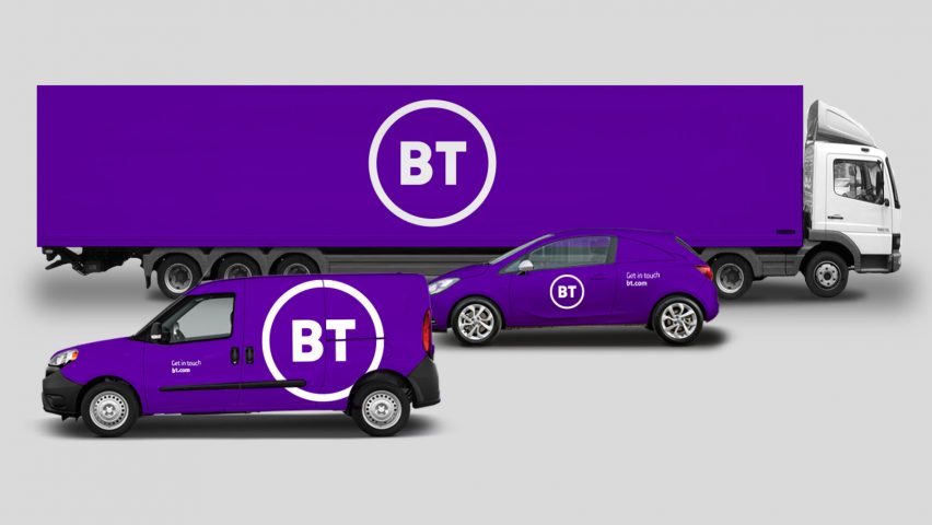
The new logo is designed to represent each part of the multifaceted business, from consumer broadband and mobile phones to sports and global services.
This included redesigning the logo, iconography, typography, photography, products and digital platforms of the BT brand to create a single uniform visual system.
"That's where this idea of pure simplicity came from," Franklin explained. "Our presentation was about simplicity meaning flexibility. We wanted to create something timeless that will work now, and will work in 20, 30 or 40 years time."
"We want customers to look at BT Sport and BT TV and recognise that they are the same thing, and allow the different markets to complement each other."
Logo is a symbol of bigger things to come
For research, Franklin and his team looked to brand with enduring identities, like fashion house Chanel, which hasn't changed its logo since it was designed by Gabrielle Chanel in in 1925, and manufacturing brand 3M, which has consistently used a logo printed in red block letters.
According to the designer, the new brand identity represents bigger changes consumers can expect to see in the company, including building the superfast 5G network.

"The original logo from 16 years ago was a very lowkey rebrand with a logo that was created more as a necessity rather than to illustrate any actual changes to the business, which are happening now," said Franklin.
"This is part of why we wanted to make a real change rather than just a cosmetic change in tidying up the existing logo, because it wasn't fit for purpose anyway when it was first designed."
"It was the right time and place for the business, which knew it needed to change, and they wanted us to create something that would fit the future of the organisation."
Wider trend for flat, minimal logos
While the new logo won't be seen on a wide scale until later this summer, some keen observers may have already seen it on their screens during the Champions League Final that took place last weekend.
BT has also signed a deal with the Football Association that will see its new logo printed across all the training kits worn by the England teams, including the senior men's, women's and grassroots squads.
BT is one of many brands to swap its logo for one that is flatter and more simple. Other examples include Mastercard and Uber.
Stockholm brand agency Seventy Agency also shared the opinion that less is more with its subtle redesign of the IKEA logo, which sees the blue block letters subtly enlarged to snugly fill the edges of its surrounding yellow oval.