
OlssønBarbieri makes minimalist chocolate packaging for CF18 Chocolatier
Plastic makes way for moulded paper in this chocolate packaging designed by Norwegian practice OlssønBarbieri to inspire a more mindful approach to materials. More
Plastic makes way for moulded paper in this chocolate packaging designed by Norwegian practice OlssønBarbieri to inspire a more mindful approach to materials. More
The envelope stamped with the red letter M, which has featured in every Gmail logo since its launch in 2004, has been abandoned as part of a new simplified, multi-coloured brand identity for Google's G Suite tools. More
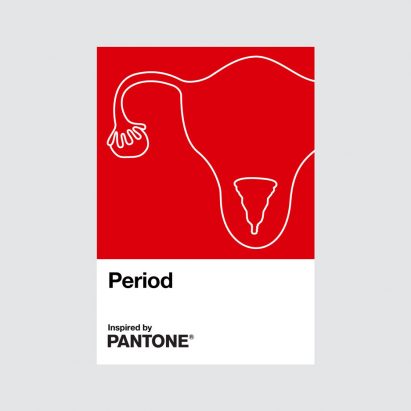
Colour company Pantone and health brand Intimina have collaborated to create an "active and adventurous" red colour to start a positive conversation around periods. More
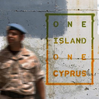
Graphic designer Alexandros Kosmidis has created UNbuffer, a series of postcards that explore the United Nations' line between the Greek and Turkish sides of Cyprus. More
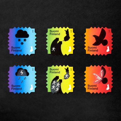
These stamps by Finnish studio Berry Creative feature images of birds and snow clouds that turn into skeletons and thunderstorms when heated to send a message about the consequences of climate change. More
British carmaker Vauxhall has revealed a flat, minimal version of its griffin emblem to replace its three-dimensional logo that had a metallic look. More
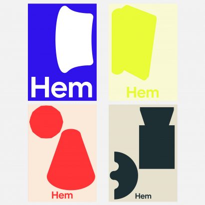
Dezeen promotion: Swedish furniture company Hem has launched a new visual identity featuring shapes based on popular products from its archive. More
Graphic designer Applied Design Works has collaborated with the nonprofit organisation Braille Institute to develop a "hyperlegible typeface" for the visually impaired community. More
Graphic designer Tamotsu Shimada has unveiled the logo for the Expo 2025 Osaka, which is an irregular ring of red circles that appears to include five cartoon-like eyes. More
Beirut-born type designer Nadine Chahine has commissioned a typeface from contributors including Erik Spiekermann and Mamoun Sakkal to raise funds for victims of the devastating explosion in Beirut. More

Pentagram has redesigned Rolls-Royce's visual identity, updating the iconic Spirit of Ecstasy emblem to become the luxury car brand's main logo. More
Design studio House of van Schneider has created a visual identity for NASA's Mars 2020 mission, which condenses the red planet, the Earth and the rover into three simple, flat shapes. More
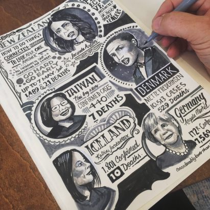
London illustrator Vic Lee has documented his experience of the coronavirus pandemic in a graphic diary, which ended up selling thousands of copies after he shared it online. More
British set designer Es Devlin has created a digital artwork titled I Saw The World End to mark 75 years since the dropping of the atomic bomb over the Japanese cities of Hiroshima and Nagasaki. More
After rebranding with three-dimensional, chrome-effect logos in the 80s and 90s, carmakers from Nissan to BMW are reverting to flat designs to retain relevance in the digital world. We've rounded up seven examples. More
Toyota Motor Europe has joined numerous other car brands by opting for a flat redesign of its logo with a revised visual identity created by The&Partnership that includes removing its wordmark. More
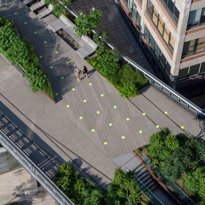
New York's High Line park has reopened to the public following coronavirus lockdown with 1,000 painted green dots graphic designer Paula Scher created as markers for social distancing. More
Japanese car brand Nissan has joined BMW, MINI and Volkswagen in officially replacing its three-dimensional emblem with a flat, two-dimensional logo. More
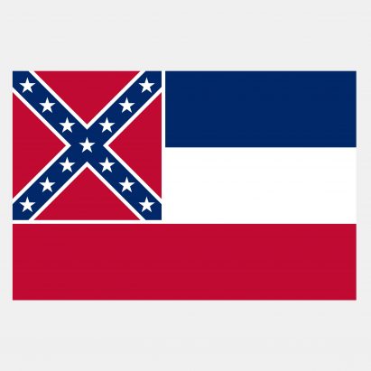
Mississippi has voted to redesign its flag to remove the Confederate battle emblem, making it the last US state to remove the controversial symbol that was used by southern states during the American Civil War. More
To mark the passing of Milton Glaser, we've rounded up 11 of the New Yorker's most interesting graphic designs from the past six decades, including a previously unreleased symbol of togetherness that he was working on up until his death. More