Ericsson's "three sausages" logo refined for digital users
Swedish technology company Ericsson has adjusted its iconic logo of three parallel lines to 18.435 degrees so it renders better on computer and mobile screens.
Revealed at his year's Mobile World Congress in Barcelona, the rebrand sees the logo, nicknamed "three sausages", changed for the first time since its creation in 1982.
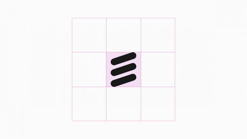
The redesign, spearheaded by studio Stockholm Design Lab, was tilted to better align with the pixel grid to fit better with Ericsson's vision as a "truly digital brand".
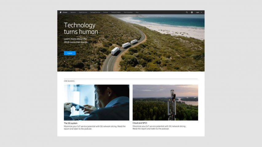
It also features a clearer typeface, simplified iconography, a high-contrast colour palette optimised for computer screens and a minimalist webpage design.
"The digital-first brand identity promises simplicity, trust, and enhanced productivity and Stockholm Design Lab's work is a response to the aim of making complexity a thing of the past with little space for ambiguity and meaningless decoration," says Björn Kusoffsky, founder and CEO of Stockholm Design Lab.
"The new brand identity focuses on functionality over aesthetics and aims to provide tools for simple communication and product performance," said the designers.
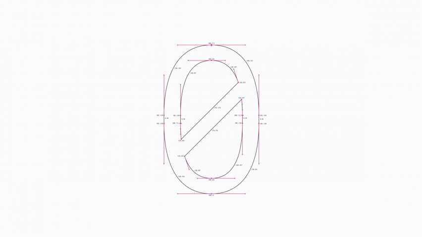
To create a smoother identity, the geometry of the logo was altered to align with the pixel grid, meaning it would appear clearly rendered on digital screens.
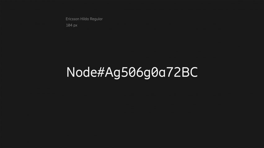
A new easy-to-read typeface called Hilda – named after one of the company founders Hilda Ericsson – also features in the rebrand.
"Hilda expresses Ericsson's business needs for today and is a versatile brand asset for tomorrow integrating across all company applications as Ericsson continues to evolve and transform," said the designers.
The colour palette was also tweaked to feature bright and high-contrast shades, including blue, red, orange, yellow, green, purple and cool grey tones.
"Our approach to colour is born from digital interfaces and information design principles," said the designers.
"The tones we have selected are digitally native, internationally bright and rich in contrast. The accent colours are primarily intended to help guide the user towards key messages and interactions, rather than distract them through unnecessary decorative usage," they continued.
The rebrand comes alongside a redesigned website, which is updated with clearer navigation and less text.
Noting an increase in the use of emojis on the internet and mobile devices, Stockholm Design Lab increased the number of icons used on the company's website.
"The internet and mobile usage has fueled icon consumption and created a greater understanding of pictograms and emojis in general," they said.
Ericsson was formed by Lars Magnus and Hilda Ericsson 140 years ago as a supplier of telephone equipment. An early pioneer of mobile telephony alongside Norwegian brand Nokia, it had around 40 percent of the global market in 1994. In 2001 its mobile division formed a separate venture with Sony, but its products struggled for market share with the advent of the iPhone and a new generation of smartphones.
The "three sausages" logo is based on the initial letter "E" of Ericsson. It was first designed by Terry Moore of Allied Designers in 1982.
An increasing number of brands are opting for stripped-back identities, including dating app Tinder that replaced its text logo with an alteration of its flame icon and file sharing service WeTransfer that ditched the "Transfer" part of its logo for a more minimal "We".