10 logo designs that made headlines
This week US First Lady Melania Trump created a logo for her children's initiative, which prompted this look back at 10 logo designs that made the headlines on Dezeen.
Melania Trump reportedly designed this logo for the Be Best initiative, a policy dedicated to promoting positivity on social media, herself.
Favouring clean lines and "wanting something that would appeal to children," President Trump's wife opted for a simple design that appears to be written using a flat-tipped marker pen.
To coincide with International Women's Day 2018, Creative Equals swapped the leading male figures for women, in the logos of some of the world's leading brands.
The organisation, which aims to promote diversity in the creative industries, wanted the visual campaign to imagine the world "through an equal lens".
Donald Trump by Tucker Viemeister
American industrial designer Tucker Viemeister designed a logo for Donald Trump, ahead of him becoming the Republican party's official presidential nominee.
Resembling the swastika symbol used by the Nazis, the logo was intended to reflect the billionaire's "racist hate-mongering", while starkly contrasting with Michael Bierut's design for Hillary Clinton.
In its first logo redesign for over 50 years, German airline Lufthansa changed its 100-year-old logo from yellow to blue, prompting industrial designer Clemens Weisshaar to label it as a "design belly flop of epic dimensions".
The logo, which depicts a stylised flying crane inside a circle, was first created by German architect and designer Otto Firle for Deutsche Luft-Reederei (DLR), Lufthansa's predecessor.
Hillary Clinton by Michael Bierut
The logo for Hillary Clinton's US presidential campaign was created by American designer Michael Bierut, partner at design consultancy Pentagram.
Following the election, Bierut expressed his sorrow that the simple "H" with an arrow through the middle was not enough to help Clinton win the election.
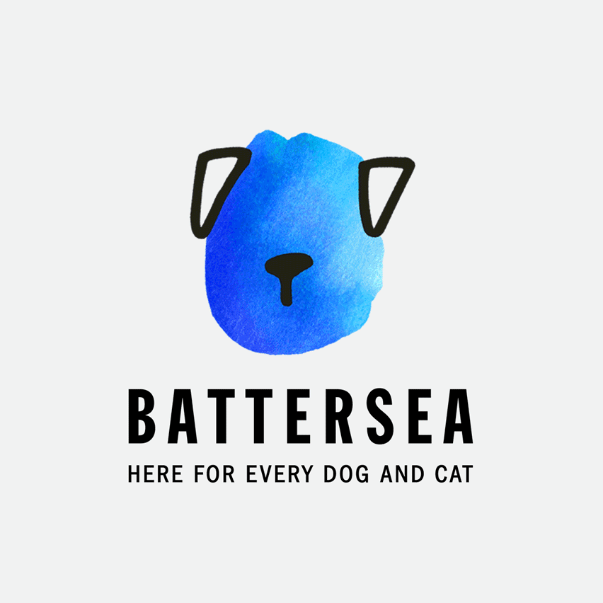
Wanting to present itself "as both a compassionate caregiver and a leading authority in animal welfare," dog and cat charity Battersea, as it's now known, commissioned Pentagram to provide it with a new visual identity and brand strategy.
It resulted in a "family" of hand-drawn logos of different breeds of cats and dogs, each devoid of facial features yet retaining "a strong sense of individuality."
Interbrand's reinvention of Italian football club Juventus' logo, titled Black and White and More, caused uproar amongst fans.
The minimalist rebrand replaced the original logo that featured the silhouette of a charging bull with two J-like stripes.
In celebration of Dezeen's 2018 film about Emeco, Jean Jullien recreated Swiss designer and typographer Micha Weidmann's original Dezeen logo in his trademark hand-drawn style.
Jullien's illustrations are also showcased in the animated film, which explores products from across Emeco's 75-year history.

The five interlinked rings created by Pierre de Coubertin for the Olympics have been included in many of the graphics for the games.
Legendary graphic designer Milton Glaser gave the 2016 Olympic logo, design by Brazilian agency Tatil, the nod of approval saying it "feels like something new."
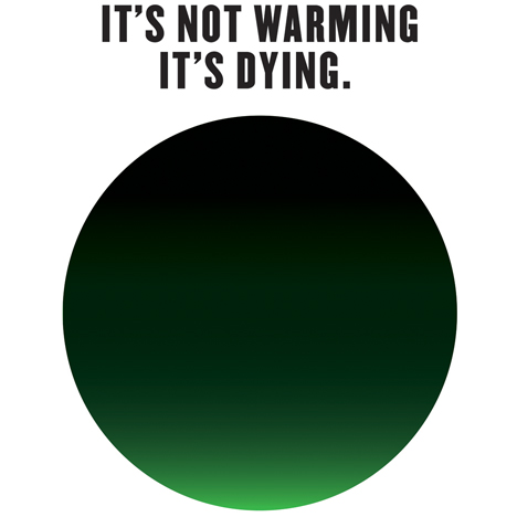
It's Not Warming, It's Dying by Milton Glaser
For the It's Not Warming, It's Dying campaign Milton Glaser, the graphic designer behind the ubiquitous I heart NY logo, created a simple visual comprising a green disk obscured by black smoke.
The campaign aims to create a greater sense of urgency around climate change using an image that suggests an aerial view of the Earth with only a narrow band of life remaining.